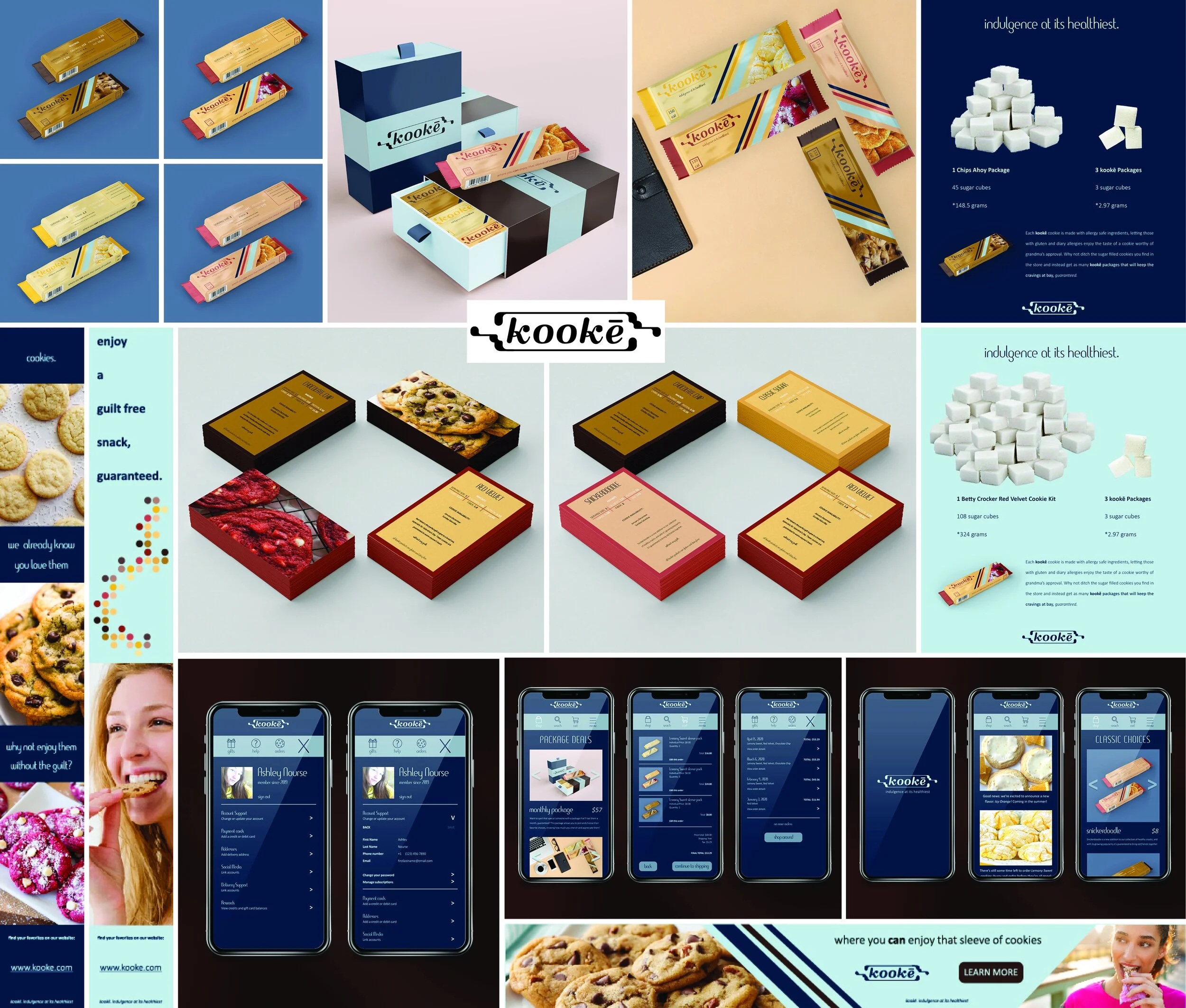
PACKAGE DESIGN PROCESS
When given free range on how to expand our company’s branding system, I wanted to showcase what a box full of a customer’s order would look like, as well as some of the products themselves. This company’s intended aesthetic is sleek and luxurious, and I wanted to convey that aesthetic by keeping information to a minimum expect for on the product’s immediate packaging.
This company has two levels of colors. The first and overall color system consists of dark brown, a rich blue, and light blue; all colors that contain cool undertones to keep the luxury sleek look. The second set of colors is based upon the colors of the cookies themselves (i.e. chocolate chip has light and dark brown).
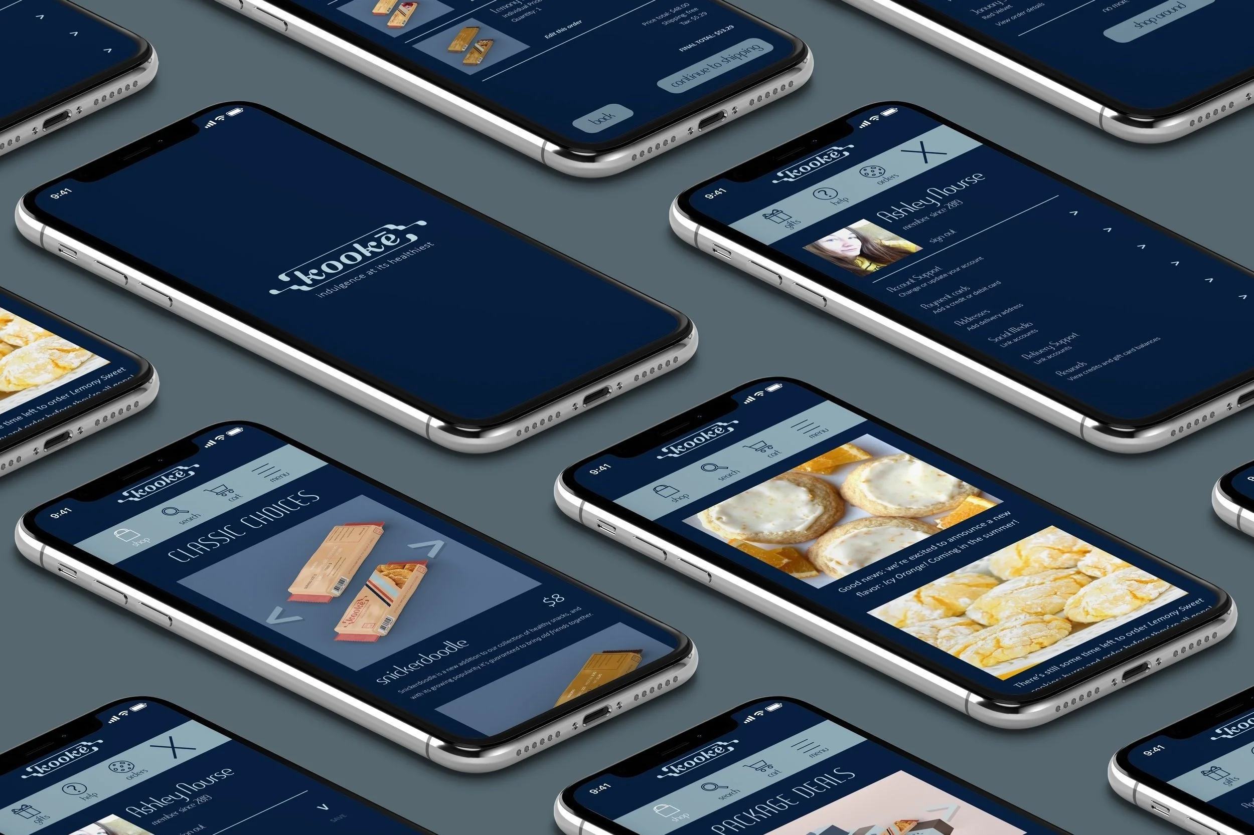
MOBILE APP DESIGN PROCESS
We were given two open applications to work on throughout the semester, and reflecting on the quarantine we all found ourselves in during this last semester, I wanted to treat this project as one that my company would create in response to a pandemic.
This app would be an extension of accessibility that’s faster than typing the URL of Kooke’s website. The app lets its user to review past orders, shop for individual or package deals, track packages, etc. The design is created in a way that lets the products speak for themselves rather than elongated explanations.